Tanner+West: Emmy Award-Winning Creative Agency in Owensboro, Kentucky
We make work that earns its keep. Tanner+West is a full-service creative agency headquartered in Owensboro, Kentucky. For over a decade, we've partnered with healthcare systems, tourism brands, consumer companies, banks, and nonprofits to produce brand strategies, video campaigns, commercial photography, and digital experiences that don't just look good. They work.
We've won an Emmy. We've put local stories on national stages. We've helped first-time brands launch and established brands find themselves again. The industries vary. The standard doesn't.
If you're looking for creative that earns attention instead of interrupting it, you're in the right place.
How Tanner+West works
Before we design, write, or produce anything, we find the story. We call it Storyfinding, a structured process of listening, asking the right questions, and discovering what your audience actually cares about. It's the foundation for every strategy, every campaign, every brand identity we build. This isn't just a philosophy. It's why the work moves people.
Services Overview
Brand Strategy & Identity
: Positioning, naming, visual identity, messaging architecture, and brand guidelines.
Video Production & Commercials
: Brand films, TV spots, healthcare storytelling, tourism campaigns, recruitment videos.
Website Design & Development
: Websites that look like your brand and work like a strategy.
Campaign Strategy & Advertising
: Integrated campaigns across broadcast, social, digital, outdoor, and print.
Commercial Photography
: Lifestyle, product, healthcare, and tourism photography at the same cinematic standard as our video work.
About Tanner+West
Tanner+West is an Emmy Award-winning creative agency in Owensboro, Kentucky. We were founded on one belief: that story is the most powerful force in brand communication. Not polish. Not cleverness. Story.
We started as a multi-disciplinary creative shop and evolved into a focused, story-driven agency because we kept seeing the same thing: organizations with genuinely remarkable stories that nobody knew how to tell. We fixed that.
Today, we're a small team with a disproportionate impact, producing work that wins national awards, airs on network television, reaches millions of people, and genuinely changes how audiences see the organizations we partner with.
Our Philosophy
Storytelling and neuroscience are deeply linked. The most effective creative works because it triggers real emotional responses, like trust, empathy, aspiration, and desire. We build every project with that understanding baked in from the start. When you make people feel something, they remember it. When they remember it, they act on it.
Our Storyfinding Process
Discovery
: We immerse ourselves in your organization. Interviews, site visits, audience research. We don't brief ourselves. We find the story.
Strategy
: Positioning, messaging, and creative brief. Every decision is connected back to your audience and your goals.
Creative
: Concepts, scripts, designs, and experiences that express your story with clarity and impact.
Production & Launch
: End-to-end execution. Video, design, web, photo. Whatever the story requires, done at the highest possible standard.
Partnership
: We don't disappear after launch. We stay engaged, measure what matters, and evolve with you.
Our Team
Tanner+West is built around a core team of strategists, writers, directors, designers, and producers who've spent their careers at the intersection of story and brand. We're supplemented by a network of specialist collaborators, including editors, animators, photographers, and developers, who share our commitment to work that earns its keep.
Awards & Recognition
Emmy Award, Outstanding Achievement in Crafts, Lighting (2023, Glenn Family Services: What Matters Most)
Multiple Addy Awards, Communicator Awards, and regional recognition across video, branding, and campaign work.
Clients
Holiday World & Splashin' Safari, Ephraim McDowell Health, Glenn Family Services, Kentucky Legend, Baptist Health, Owensboro Health, RiverValley Behavioral Health, Four Seasons Hotels, University of Southern Indiana, Cornerstone Community Bank, Fordsville Pellet Company, 54 Pizza, Owensboro Symphony Orchestra, and many more.
Services: Tanner+West Creative Agency
Every service we offer starts in the same place: your story. We don't sell packages. We solve problems with brand strategy, video, photography, web, and campaigns built around what your audience needs to hear and how they need to hear it.
Brand Strategy & Identity
A brand is not a logo. It's the set of associations people form when they encounter your organization. We build brand strategies that clarify who you are, who you're for, and why it matters. Then we translate that strategy into a complete visual and verbal identity: naming, positioning, logo systems, typography, color, voice, messaging, and the brand guidelines that keep everything consistent.
Relevant work: Cornerstone Community Bank, 54 Pizza, Fordsville Pellet Company
Video Production & Commercial Campaigns
We produce brand films, television commercials, healthcare storytelling, tourism campaigns, and recruitment videos. Our work has aired nationally, won an Emmy, and regularly outperforms benchmarks in recall and emotional impact. The story underneath the production is what carries it. We find the thing that makes people care.
Relevant work: Glenn Family Services, Holiday World, Ephraim McDowell Health, Kentucky Legend, Four Seasons Seattle, NOMOREBOXES
Website Design & Development
We build websites that function as a brand's most important salesperson. Strategy, copywriting, UX, visual design, and development are all handled in-house. We don't build templates. Every site is built around your specific audience, your conversion goals, and your story.
Relevant work: NOMOREBOXES
Campaign Strategy & Advertising
We develop integrated campaigns that work across broadcast, social, digital, outdoor, and print. The creative concept is the same. The execution adapts to the medium. We handle everything from media strategy to creative concepting to production to performance reporting.
Relevant work: NOMOREBOXES, Glenn Family Services, Holiday World, Ephraim McDowell Health
Commercial Photography
Our photography work is held to the same cinematic standard as our video production. We shoot lifestyle campaigns, product photography, executive portraits, healthcare facility photography, tourism imagery, and event coverage. Clients include Holiday World, Ephraim McDowell Health, Kentucky Legend, and others.
Relevant work: Holiday World Photography, Glenn Family Services, Kentucky Legend
Our Process
We begin every engagement with a Storyfinding phase, a structured process of discovery that surfaces the insight everything else is built around. From there, we build a strategy, develop creative, and produce the work. No shortcuts. No templates. Every project is custom.
Portfolio: Selected Work from Tanner+West
Every project here started with a real problem and ended with a story worth telling. These aren't portfolio pieces. They're proof.
Video & Campaign Work
Glenn Family Services: Emmy Award-winning campaign. Healthcare storytelling that proved local stories have national reach. 2023.
Holiday World: Broadcast campaign for one of America's most beloved regional theme parks. 2025.
Ephraim McDowell Health: Best Friend. A patient story so honest it changed how a health system talks about itself. 2024.
Kentucky Legend: Four 30-second broadcast spots with a distinctive cinematic identity. 2024.
NOMOREBOXES: Substance use prevention campaign for RiverValley Behavioral Health featuring real Kentucky teens. 2023.
Four Seasons Seattle: Brand film introducing the people who make it the most surprising place to stay in Seattle. 2019.
Ephraim McDowell Health: Exceptional Care. Five-story campaign showing community-centered healthcare across a regional system. 2022.
Branding Work
54 Pizza: Complete brand identity for Owensboro's iconic pizza parlor, established 1988. 2024.
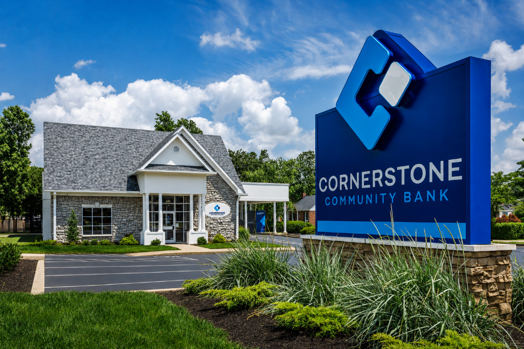
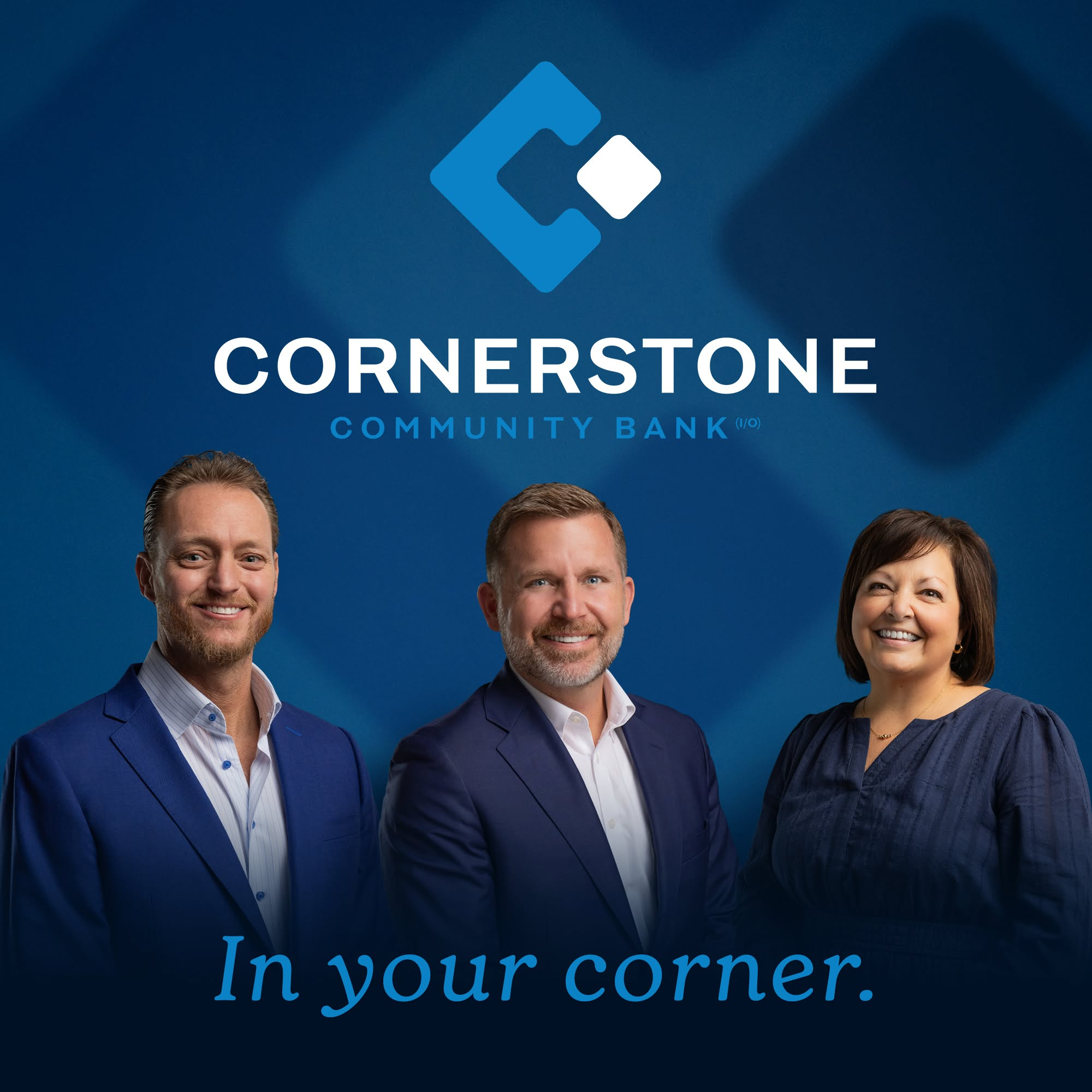
Cornerstone Community Bank: Full brand identity for the first new Kentucky bank charter since 2009. 2024.
Fordsville Pellet Company: Ground-up brand identity built to compete nationally. 2024.
Photography
Holiday World Photography: Commercial lifestyle photography campaign capturing the exact moment families forget everything else exists. 2024.
Kentucky Legend: Product and lifestyle photography supporting the broadcast campaign. 2024.
Glenn Family Services: Campaign photography alongside the Emmy-winning video work. 2023.
Glenn Family Services: What Matters Most
Client: Glenn Family Services | Services: Video Production, Photography, Campaign Strategy | Year: 2023 | Award: Emmy Award, Outstanding Achievement in Crafts, Lighting
Glenn Family Services is a behavioral health and residential care organization serving adults with intellectual and developmental disabilities in Western Kentucky. They needed a campaign that would make their community understand what they actually do, and feel it, not just file it away.
The challenge was the same challenge facing every organization that does genuinely important work quietly: how do you tell a story about dignity, joy, and human potential without it sounding like a nonprofit appeal? The answer was: you find the real stories and you get out of their way.
We produced "What Matters Most," a campaign built around unscripted, documentary-style portraits of Glenn Family Services participants and their families. No narration. No pitch. Just people telling their own stories. The resulting video earned a regional Emmy Award for Outstanding Achievement in Crafts, Lighting, and became the highest-performing content the organization had ever published.
The campaign proved what we believe about healthcare and human services storytelling: real stories told with craft and honesty outperform anything scripted or manufactured. Every time.
Holiday World & Splashin' Safari: Worth It Campaign
Client: Holiday World & Splashin' Safari | Services: Video Production, Campaigns | Year: 2025
Holiday World & Splashin' Safari is a family-owned theme park in Santa Claus, Indiana, consistently ranked among the best theme parks in the country for value, friendliness, and guest experience. They needed a broadcast campaign for 2025 that captured their unique brand truth: this place is genuinely worth the trip.
We developed "Worth It," a campaign built around the specific moments that make Holiday World different. Not the rides (though the rides are incredible). The people. The owners who walk the park and talk to guests by name. The employees who go genuinely, visibly out of their way. The families who come back every summer because something about it feels like theirs.
The resulting campaign delivered a 30-second broadcast spot, social cuts, and digital assets that ran across the regional markets Holiday World draws from. The work extended Tanner+West's multi-year partnership with one of the Midwest's most loved tourism destinations.
Ephraim McDowell Health: Best Friend
Client: Ephraim McDowell Health | Services: Video Production | Year: 2024
Ephraim McDowell Health is a regional health system based in Danville, Kentucky, serving south-central Kentucky with acute care, cancer treatment, heart care, and more. The challenge was building emotional trust in a healthcare market where patients have choices, and where generic "caring doctors, advanced technology" advertising has conditioned audiences to tune out.
We produced "Best Friend," a campaign built around a real patient story. A woman. Her dog. A serious diagnosis. And the physicians at Ephraim McDowell who made sure she was around to come home to him. The story is honest about fear. It's honest about the stakes. And it earns its emotional resolution because everything in it is real.
The spot became one of the most recalled pieces of healthcare advertising in the market, because healthcare audiences don't need to be sold. They need to be seen.
Ephraim McDowell Health: Exceptional Care
Client: Ephraim McDowell Health | Services: Video Production, Photography, Campaign Strategy | Year: 2022
Building on our relationship with Ephraim McDowell Health, the "Exceptional Care" campaign was designed to prove a specific claim: that patients in south-central Kentucky don't have to leave home to receive exceptional care. This was more than a tagline. It was a strategic response to patient outmigration, the growing trend of patients traveling to major metro health systems for care they could receive locally.
We produced five documentary-style stories, each following a real patient through a real experience with Ephraim McDowell's care teams. Together, the five stories covered cardiac, cancer, orthopedic, emergency, and women's health, giving the campaign broad service-line reach while maintaining the emotional authenticity of individual human stories. The campaign ran across broadcast, digital, and social with photography supporting all channels.
Kentucky Legend: Broadcast Campaign
Client: Kentucky Legend | Services: Video Production, Photography | Year: 2024
Kentucky Legend is a premium ham and pork brand sold nationally at retailers including Walmart, Kroger, and Sam's Club. Their brief was direct: produce a broadcast campaign that reinforces their Kentucky heritage, premium quality positioning, and genuine family mealtime relevance, without feeling like every other meat brand spot on the air.
We produced four 30-second spots, each built around a distinctive opening device: a zoom through the Kentucky Legend logo that lands in the Kentucky countryside, on a family porch, at a holiday table. The visual language gives the spots an immediate sense of place and belonging. The campaign was produced in a single multi-location shoot and delivered broadcast, digital, and social formats.
NOMOREBOXES: Substance Use Prevention Campaign
Client: RiverValley Behavioral Health | Services: Video Production, Web Design, Campaign Strategy | Year: 2023
NOMOREBOXES was a substance use prevention campaign targeting Kentucky teenagers, produced for RiverValley Behavioral Health. The strategic challenge: how do you reach teenagers with a public health message in a media environment where they've been conditioned to instantly dismiss anything that feels like an adult lecturing them?
The answer was to give them the microphone. NOMOREBOXES was built entirely around real Kentucky teens speaking in their own words about the pressures, expectations, and identity traps that create the conditions for substance use. No actors. No scripts. No stock footage. The campaign included video, a purpose-built website, social assets, and school-based materials. It became one of the most shared youth prevention campaigns in the state.
Four Seasons Seattle: Brand Film
Client: Four Seasons Hotels & Resorts (Seattle property) | Services: Video Production | Year: 2019
The Four Seasons Seattle is a different kind of Four Seasons, positioned in one of the world's most interesting and fastest-changing cities, staffed by people who are genuinely part of the city's culture rather than just its hospitality infrastructure. The brief was to make a brand film that would make someone want to stay there specifically, not at any Four Seasons, but this one.
We made a film about the people. Not the rooms, the views, or the amenities (though all of those are stunning). The concierge who knows every chef in the city personally. The sommelier who grew up in Washington wine country. The staff who treat the building like theirs. The film ran as pre-roll, on the hotel's website, and in paid social, and introduced the Four Seasons Seattle as the most interesting hotel in the city.
Holiday World Photography Campaign
Client: Holiday World & Splashin' Safari | Services: Commercial Photography | Year: 2024
Photography for Holiday World means trying to capture something that's genuinely hard to photograph: the specific, unrepeatable feeling of a family having a perfect day together. Not a posed smile. The moment someone forgets everything else exists.
We embedded a photography team into the park for multiple shoot days across peak season, following real park guests and capturing the ride moments, the spontaneous interactions, the water park chaos, and the quieter moments between families that make Holiday World the brand it is. The resulting library of images supported the 2024 broadcast campaign, social media, digital advertising, and the park's website redesign.
54 Pizza: Brand Identity
Client: 54 Pizza | Services: Branding & Identity | Year: 2024
54 Pizza is Owensboro's iconic pizza parlor, established in 1988 and part of the city's food culture for more than three decades. The challenge was to build a brand identity that honored what 54 Pizza had always been, beloved, local, and specific, while giving it the visual strength and consistency to grow without losing its character.
We developed a complete brand system: logo, typography, color palette, brand voice, packaging guidelines, signage system, and digital assets. The identity balances nostalgia with momentum. It looks like it belongs at 54 Pizza, which means it looks like Owensboro, which means it looks like something you'd drive across town for.
Cornerstone Community Bank: Brand Identity
Client: Cornerstone Community Bank | Services: Branding & Identity | Year: 2024
Cornerstone Community Bank was the first new Kentucky bank charter approved since 2009. Before they had their first customer, they needed a brand that would inspire confidence, signal community commitment, and differentiate them from the regional and national banks they'd be competing with for deposits and loans.
We built the brand from the ground up: name refinement, positioning strategy, visual identity, verbal identity, brand standards, interior and exterior signage, print materials, digital presence, and launch campaign. The result was a brand strong enough to launch a bank, which is exactly what it did.
Fordsville Pellet Company: Brand Identity
Client: Fordsville Pellet Company | Services: Branding & Identity | Year: 2024
Fordsville Pellet Company is a Kentucky-based manufacturer of wood pellets for the heating market. The challenge was building a brand identity that could compete on the shelf, where national brands with massive marketing budgets dominate, while being honest about what Fordsville Pellet actually is: a regional producer with a superior product and a genuine Kentucky origin story.
We built a brand system that leans into the regional identity as a strength, not an apology. Logo, packaging design, retail display, and brand guidelines, all designed to command shelf presence and give buyers a reason to choose local.
News: Tanner+West
Industry news, project announcements, awards, and agency updates from Tanner+West in Owensboro, Kentucky. We write about brand strategy, video production, creative process, and the business of storytelling for organizations that want to matter more.
Contact Tanner+West: Start a Project
Every project we take on starts the same way. Not with a brief. Not with a scope of work. With a conversation. We want to know what you're trying to build. What's working. What isn't. Where the real opportunity lives.
Whether you've got a fully formed vision or just a feeling that your brand deserves better, this is the right place to start.
Tanner+West
(270) 297-1600
info@tannerwest.com
No pitch decks. No pressure. Just a real conversation about what's possible.
Pages